Colors, conversion and web design
Shock content from web design news. 62 to 90% of buying decisions are based on color!
Have you heard the story of how one digital slots company changed the color of the call to action button from green to yellow, and this led to a mind-blowing increase in conversions? The growth was 187.4%!
But back to websites. The essence of an orange is orange juice, and the essence of web design is to influence the user's subconscious. The task of website design is to change the attitude of a person to your product and encourage him to take a targeted action. that is, make a purchase / register / leave your data.
You can't argue with statistics. According to her, choosing colors for a web page is much more than decoration. No magic: every time we see a certain color, in a special part of the brain, the hypothalamus, a chain of reactions occurs. The thyroid gland receives hormones that cause emotions that affect our behavior.
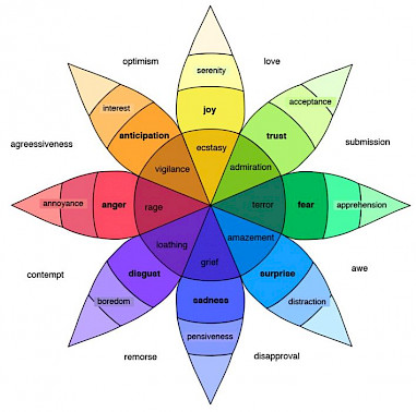
And now more specifically. Here is an interesting version of the color wheel with emotional meanings of shades.

Now let's think about where we need to work on the topic of color solutions in the first place. Pay special attention to the following elements:
• Images
• headers
• popup windows
• background shades
• frames
• important banners and the first screen on the main page
• buttons, especially calls to action (CTI)
An important point: the perception of the color solutions of your web design also depends on the target audience. Therefore, be sure to put yourself in the place of the people for whom the product is designed. Feel what kind of generation this is, what values and dreams they have ... and act! Everything will work out.


